
When you create a Joomla slideshow using Slideshow CK, it's responsive by default : the width adapts to the container and the height accordingly. But you can manage it to behave differently depending on the resolution, and also to save the bandwidth for the mobile devices.
Setup the original dimensions for your images
The demo data are setup with these settings :
- width:
auto - height:
62%
By using % in the height, it will keep the original ratio of your images. If you give some values in px for the height, it will stay fixed at this value and your image may be truncated when you reduce the screen width.
Height in %
This is the recommended method : it will resize your image and keep its original ratio. The image will not be truncated, but resized accordingly to the width/screen value. To setup the % value, you must calculate the ratio of your image :
ratio = height / width * 100
Example :
Image dimensions : 1280 x 800 px
Ratio = 800 / 1280 * 100 = 62%
This is the value that you must enter in the height field in the module options.
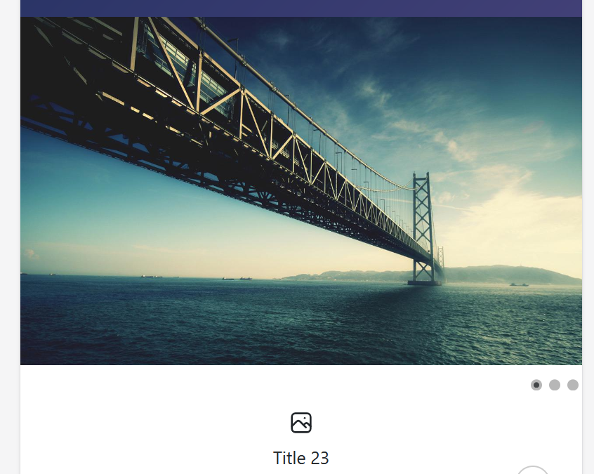
Screenshot of the initial size on large screen with 62% height :
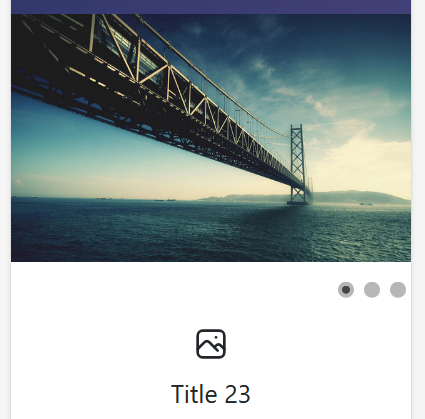
Screenshot of the size on small screen with 62% height :
Height in px
You can choose to setup the slideshow with a fixed height in px. When you do that, the slideshow will not resize according to the image ratio, but keep always the same height and truncate the image accordingly. This is not recommended unless you need it for a special design.
Setup the breakpoint for small screens
Sometimes you want the slideshow to behave differently on small screens, it means have a different height compared to large screens. You can do that by using a breakpoint : give a resolution value under which the slideshow will change it's dimensions.
For example you can have these settings :
- default height :
62% - at 800px width (resolution of the screen) the height changes for :
100%
Using these settings, the slideshow will become bigger (higher) on small screens. But not that changing the ratio will also truncate your images. This can still be very useful to focus on the main part of the image and have a bigger slideshow.
Screenshot of the size on small screen with 62% height (original ratio) :
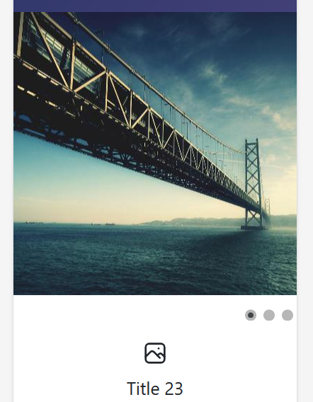
Screenshot of the size on small screen with 100% height (breakpoint ratio) :
Min height for small screens
This option is usefull to avoid your slideshow to become ridicoulously small. If the slideshow height is too small, then your visitors will not see anything. You can control the minimum height that you want to give to your slideshow.
When it comes to this height value, it stays at this value and the image will be truncated if the screen width become smaller.
Setup the specific images for mobile
This option is different from the previous ones, because you can manage the image files. You can select a resolution under which you will deserve other images to the slideshow which can be useful to reduce the bandwidth and give a faster page load on small screens and mobiles.
For example :
- default image size for all devices : 1280 x 800 px, 112 Ko
- specific image for mobile at 640px : 640 x 400 px, 37 Ko (67% smaller !)
How it works ? the image will not change if your reduce the screen size, it will only work on page load :
- if the screen size is over 640px when the page load, then we are on a large device and the default image will be loaded
- if the screen size is at 640px or below, then we are on a small device (mobile device) and the specific image for mobile will be loaded
Doing this you can improve the loading time of your website for mobile device by serving smaller and optimized images.
Automatically create the specific images
You can choose to let Slideshow CK create the reduced images automatically. This is useful and easy to do. Go in the Advanced options >> Create the thumbnails automatically.
The folder will be created automatically under the root folder with a reduced copy of the images.
Example :
- original image :
images/slides/bridge.jpg - specific image for 640px :
images/slides/640/bridge.jpg
The images will be created in a subfolder which has the resolution value as name.
Create the specific images manually
Sometime the automatic feature does not create the images as you want (bad resolution, or problem for your server to create the images). In this scenario you can choose to create the reduced images yourself.
Put your images in the folder images/slides/640/bridge.jpg , it's the same as the one created automatically. 640 is the resolution that you have defined in the options.


News