Create some amazing web designs using the Shape divider
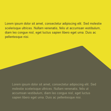
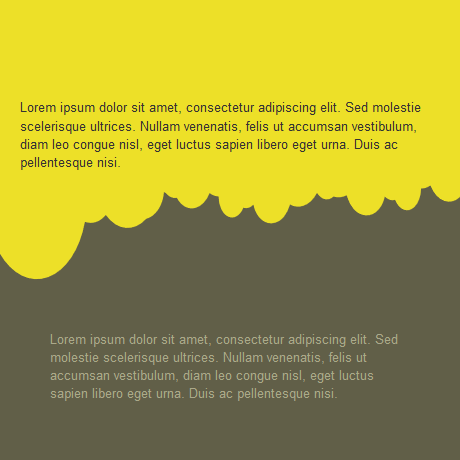
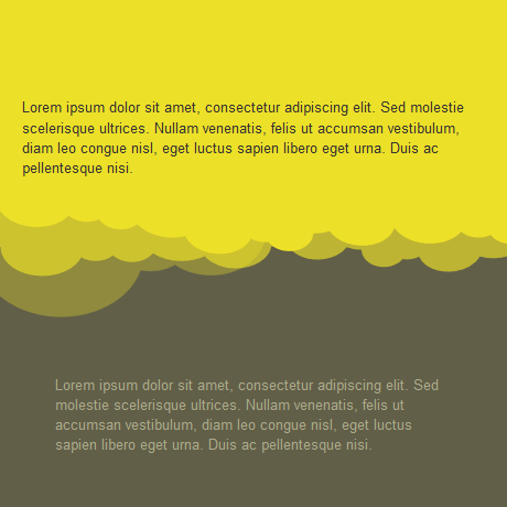
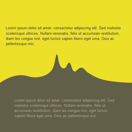
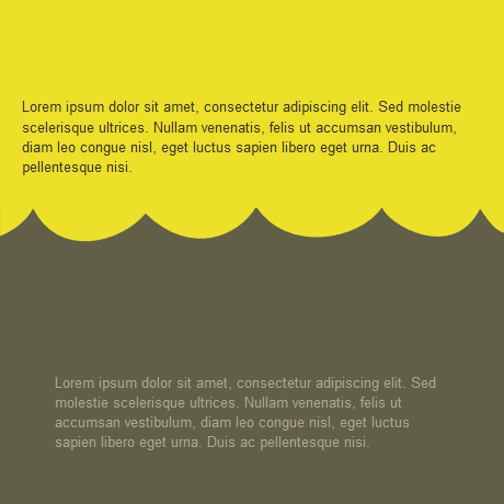
Shape divider are graphical parts that you can add to separate the sections of your page. Hereafter is a preview of the shape dividers that are available into Page Builder CK.
Examples of shape dividers
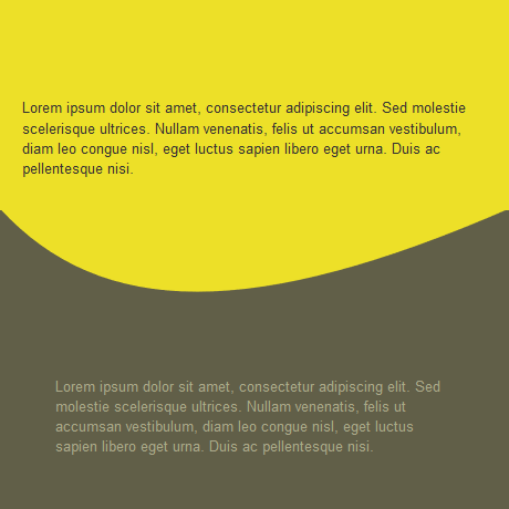
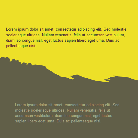
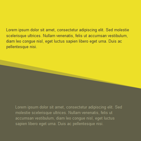
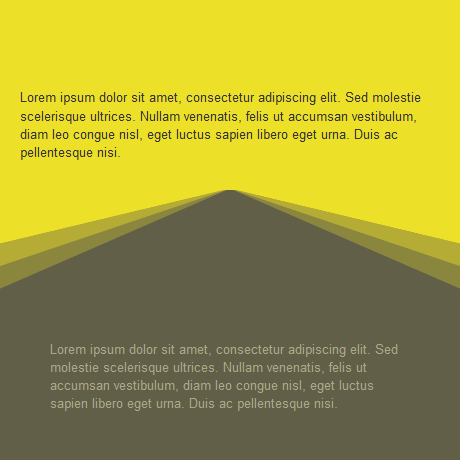
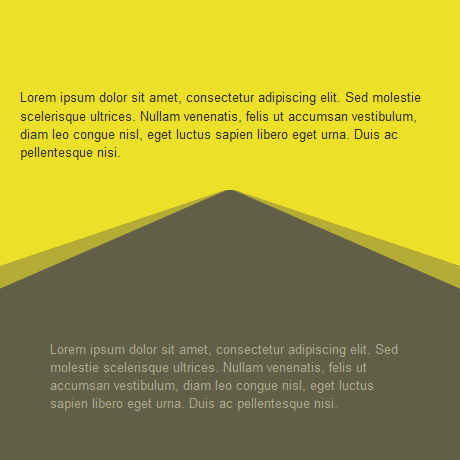
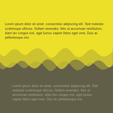
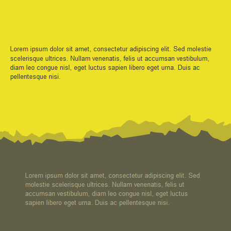
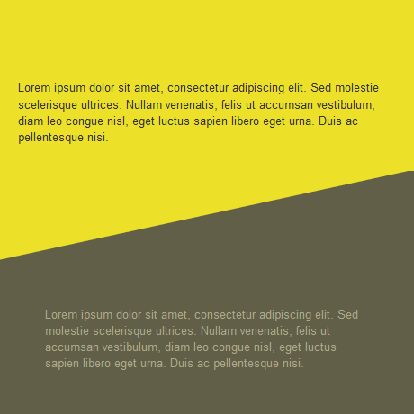
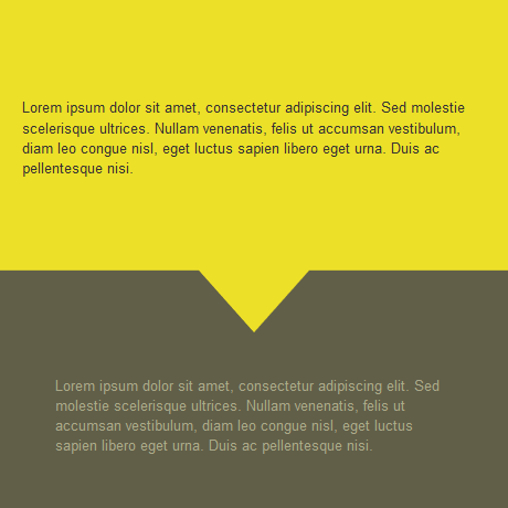

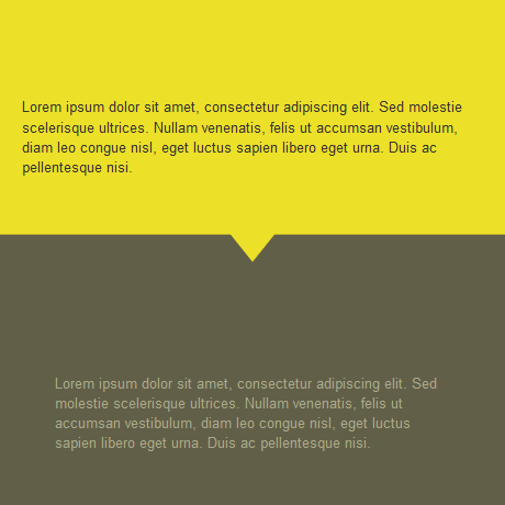
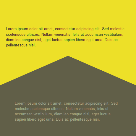
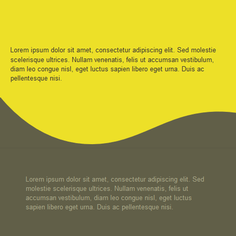
How to add a shape divider
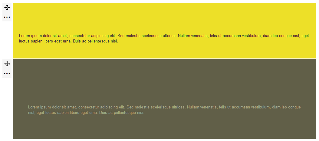
Create at least 2 sections (rows) in your page.
Edit the CSS styles of the bottom section
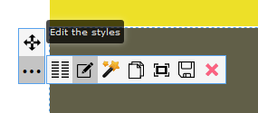
You will open the left panel where you will find the tab for the Shape divider
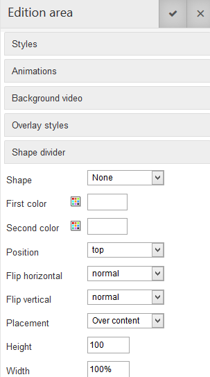
List of options
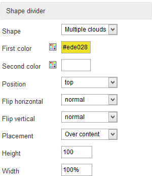
- Shape : select the shape that you want to use in the list
- First color : this is the main shape color to fill the shape with
- Second color : you can force the second color (mainly like a background color). In many cases you don't need it
- Position : choose if you want the shape to take place at the top of the bottom of your section
- Flip : normal or inverse, choose what you want
- Placement : this will put the shape under the content (for example text over the shape), or the shape over the content (for example that cuts an illustration)
- Height : this value can be set in % or px. By default it will be 100px, you can play with it to get the desired result
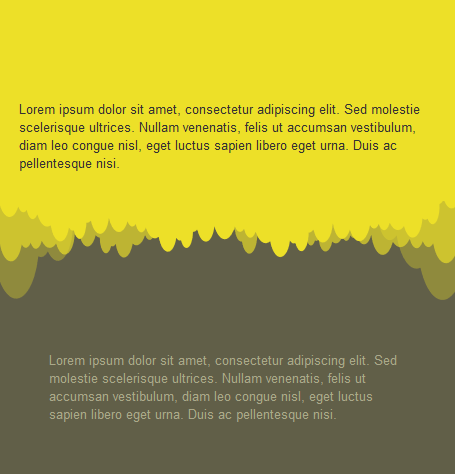
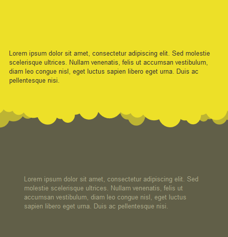
- Width : this value can be set in % or px. By default it will be 100px, you can play with it to get the desired result. Note that a width in % will stretch the shape as a width in px will keep the shape ratio and cut it off
Hereafter you will get the options to create a simple cloudy divider :
Example with 100% width
Example with 1000px width


News